AUCKLAND, Monday: Downtown design agency Dow Goodfolk is leading the transition of the Mac’s brand into cans for the first time – for existing favourites and new brews.
Account director Rebecca Hamer said: “The brief was a designer’s dream – an exciting mix of strategic & creative scope.
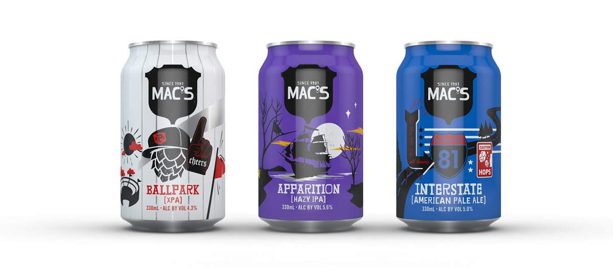
“We were asked to push the boundaries, retaining the core spirit and distinctive brand assets of Mac’s, but with the freedom to create a new design system and creative identity for an expanded range of new craft beers.
“Beer in cans is a massively growing part of the market, and it’s no real surprise. Cans are convenient, portable, deliver colder beer faster, and are better for the environment.
“And from a design point of view, cans equal more room to work with and the opportunity to introduce a 360-degrees design approach using illustrations and icons to link the design around the whole can and extend the world of Mac’s.
“Our design start point was to take the standout Mac’s silhouettes and make them ‘more,’ extending the hero icons to introduce consumers to more of the world that those icons live in.
“Dow Goodfolk quickly conceptualised the design and finished the artwork in little more than a week. Waste not, want not!”
“And for each of the three fantastic new beers created by the brewing geniuses at Mac’s – Apparition, Ballpark, and Brewjolais (the latter being a rebirth of a Mac’s tradition from before the Christchurch earthquake, a fresh hop IPA using 2020 hops) – this meant having a clean slate to create each variant’s Mac’s world.
“For each of the beers, we made the visual experience more three-dimensional for the respective worlds, adding layer on layer and challenging the status quo of craft beer and how it should present.
“Central to our whole process was a collaborative approach with the Mac’s team conceptualising the beers and the stories that wrap around them, riffing off one another to multiply the inspiration, and then building the personalities step by step.
“For the 330ml cans, our two new players were Ballpark, a light and easy-drinking XPA, and Apparition.
“With hazy IPAs being the fastest growing style in craft beers, Apparition with its fruit flavours and a smooth, but bitter, finish, personifies the illustration on the can of a pirate ship gliding smoothly through tropical waters, but with the moonlight casting eerie shadows.
“Dow Goodfolk quickly conceptualised the design and finished the artwork in little more than a week. Waste not, want not!”
Brewjolais, in its sleeker, taller white can, was a little different. Carefully brewed and ready to go on tap at Little Creatures in Hobsonville, when the country went into lockdown it looked like this fresh hop IPA was going to be MIA.
“But with true entrepreneurial spirit, the Mac’s team quickly problem-solved to get the beer into cans and out to consumers, and Dow Goodfolk worked alongside them, quickly conceptualising the design and finishing the artwork in little more than a week. Waste not, want not!
“The result. Mac’s cans are up and running, and taking it to the craft beer market, one new Macs personality at a time. So watch this space for new arrivals, they could be coming at any time.”
Lion’s Ben Fisher said: “Releasing the newest Mac’s beers in cans, we wanted to take advantage of the additional real estate while staying true to our current visual identity and brand aesthetic.
“Interstate and Brewjolais already had some existing design elements, and Dow Goodfolk were able to quite literally extended these to wrap around the can, but with a lot more detail and depth.
New scenes
“While with Apparition and Ballpark, we got to create two completely new scenes based on the individual beer styles to give people an idea of what to expect in the cans and bring the world of Mac’s to life.”
Share this Post