The family-owned firm of Farrah’s has been a national name since 2010 and now leads the flatbread category. But the sector is undergoing a transformation.
In the United States, wraps outsell sliced white bread. Although NZ is not quite there yet, demand for wraps is growing quickly. This growth has attracted many new competitors, sparking Farrah’s to conduct a major brand review with Brother Design. The result is a whole new look and strategic approach, evident in the packaging, in-store presence and communications.
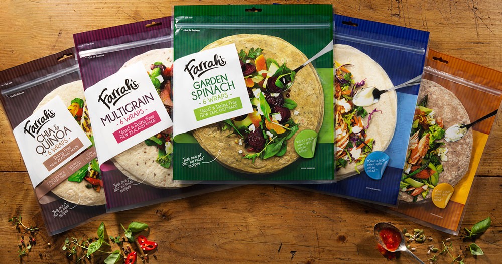
The pack design breaks new ground. Debbie Hyde, design director at Brother, believes it to be unique. “The design approach is not just to stand out, but actively encourage purchase,” she says. “Our aim is inspire customers and give them the confidence to use the wraps a little more adventurously.
“So the delicious-looking photography is almost a recipe: you can see what to do at a glance. And the design uses a clear window to show the actual wrap under the photography, making fantastic results seem that much closer.”
It’s this combination–seeing the actual product together with the photographic inspiration–that’s unique, according to Hyde. “We haven’t seen it before, certainly not in this category and not to the standard we’ve achieved.”
Holding a market-leading position, undertaking significant change might be seen as a risky move for Farrah’s. But according to Jenny McMillan, business development director at Brother, it was time to move. “We’re all aware that, as market leader, the conventional wisdom is don’t rock the boat,” she says.
“But the boat in this instance was already being rocked, with competitors clambering in and launching new products, derivatives and me-too range extensions, so we decided to seize the initiative and shake up the segment ourselves. We moved the game on in terms of look, feel and pack function with bold colours, a unique pack design and inspirational photography.”
The new design is already a hit. James Wigley, national marketing manager for Farrah’s, was confident they had the mix right. “We knew we had a great new look and were confident that it would be well received,” he says.
“But the endorsements and compliments have been immediate and whole-hearted. Feedback is that our new look is transformational, providing real differentiation from the competition.”
Wigley is satisfied that the design delivers on the aim of inspiring consumers, too. “The packs are great at giving consumers ideas and attracting new users to to the category– to give wraps a go. Our sales and merchandising agency told us one retailer thought it would inspire their customers to buy and experiment with more premium ingredients.
“They love that idea, and it’s a real endorsement of the design nous of Brother and everyone in the wider project team.”
The new-look range is in store now at all major and speciality supermarkets, and on view at www.farrahs.co.nz.
Share this Post