Brother Design’s work for Foodstuff’s own brand, Pams, has enjoyed a successful run at award shows here and internationally. Now they’ve added a Gold pin at the Design Institute of New Zealand’s annual Best Awards.
The Pams Confectionery range, having won a Dieline award earlier this year, was recognised by the institute as the best in Packaging, topping the new sub-category for FMCG packaging design for large volume and export products and then taking the overall Gold Pin.
“I know you’ve already covered Best Awards wins, but just in case you’re feeling generous, here’s an updated release from Brother, including the judge’s comments and a quote from Foodstuffs,” writes consultant Simon McManus.
[If you take the trouble to share an insight with M+AD readers, we’ll run it, Simon! – Ed]
Design director Paula Bunny is thrilled with the award. “There’s such stiff competition in the Best Awards, so it’s a real honour to win,” she said.
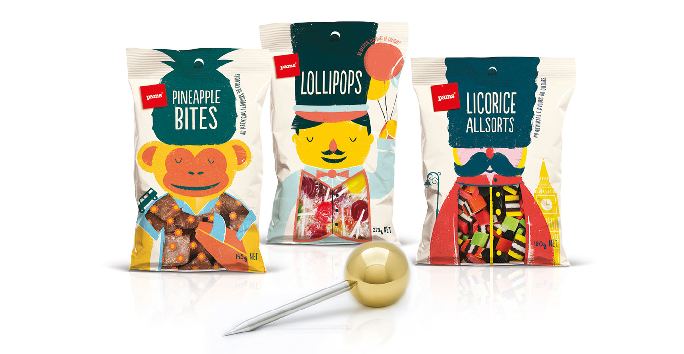
Judges comments from the Design Institute: ‘A great example of maintaining a master brand’s signature, but bringing plenty of cheek and character to dominate a category in its own right. A tasty combination of design system, typography and illustration.’
FMCG packaging is a new category for the competition, one that Bunny is especially pleased to see.
“The Pams brand could never have entered in the past so it’s fabulous to be locally recognised for our creative work. It’s such a great brand to work on, demanding we be fresh and distinctive in every single category of the supermarket, and that’s quite a challenge in the busy confectionery aisle.”
Brothers business development director Jenny McMillan, said the brief was a challenging one. “With Pams, we always want to stand out from the expected, generic look of a category’s big brand leaders.,” she said.
“The challenge here was to do so in a sector that’s bursting with loud, colourful designs. Paula’s work does it brilliantly, with captivating characters, large product windows for a tempting peek at the lollies, and colours that reflect these sweet treats contain no artificial colours or flavourings.”
Foodstuffs Own Brands national private label manager Jocelyn McCallum said: “The Pams packaging is constantly evolving to ensure it resonates with our customers. We love the work that Brother Design is creating for our brand across all of our categories and it’s fantastic that they are receiving recognition from their peers both here and internationally.”
Other successes for Brother in the competition included nominations for their Pentawards-winning work on Pams Feminine Hygiene range and for Farrah’s wraps, which had previously won Supreme Award at the Pride in Print awards earlier this year.
Share this Post