AUCKLAND, Thursday: Global tech/money management company Wise has rolled out a new look and feel with a rebrand, via UK agency Ragged Edge. Pead is Wise’s comms and messaging partner for New Zealand.
Having reached 16 million customers worldwide, the rebrand is designed to make the Wise customer experience consistent regardless of the place or language people sign up in.
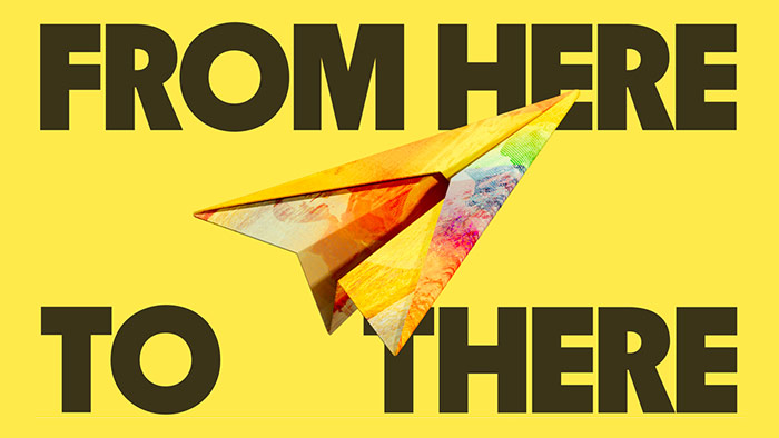
Wise CMO Cian Weeresinghe, who helped spearhead the project, says the new look will drive Wise’s mission to build money without borders.
“Over the past year we’ve introduced new features to make Wise more useful to our customers.
“Our goal: money that moves without borders.”
Our new visual brand reflects the full range of products and services we offer today, as well as the customers who we’re building for — the places they’re from and where they want to go.”
“Our customers will now see international people, places, letters and symbols in the products they use every day. And they’ll recognise some of their own world in the Wise brand, in New Zealand, New York, Jakarta or Japan.”
“Fundamental to the rebrand is a new clear, confident tone of voice, created to be understood instantly by anyone, in any language. Our bespoke typeface, Wise Sans, also incorporates letterforms inspired by scripts from across the globe.”
“Yes, we look different, and we’re building new things for you. But the core of us stays the same. Our goal: money that moves without borders.”
Share this Post