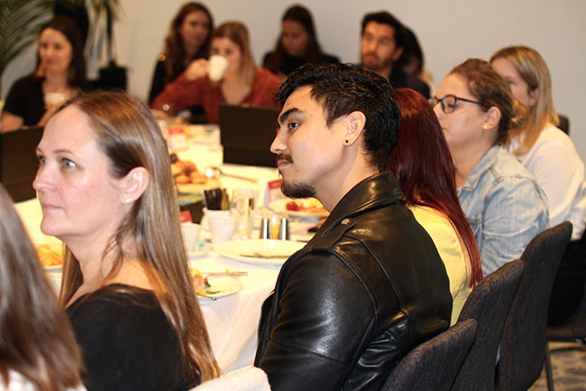
SYDNEY, Wednesday: Global image provider Shutterstock touched down in Auckland on Tuesday as part of its B&T Breakfast series roadshow, which explored the theme of visual identity.
The event was hosted by B&T reporter Daisy Doctor, and held at the Hilton Auckland to a packed room.
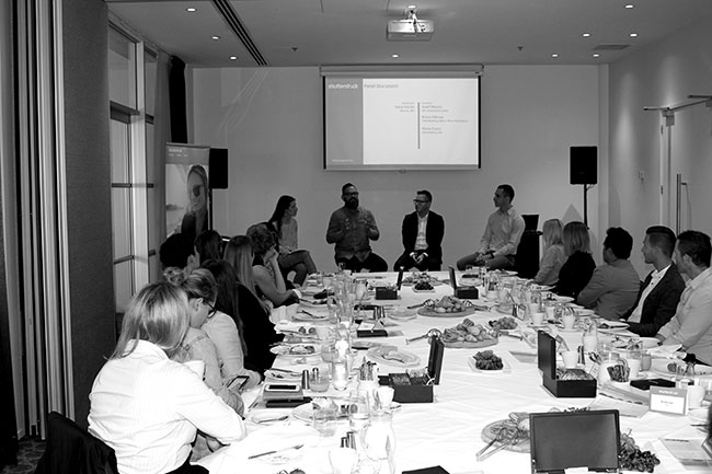
Shutterstock custom general manager Grant Munro gave the keynote address for the breakfast, during which he spoke of “the dire importance for brands to create a unique and specific visual identity”.
To dive into this topic of making brands stand out, Munro was joined by some local talent to discuss the challenges of creating a seamless visual identity in a panel discussion.
Bruce Pilbrow took to the stage he heads up the marketing team at Yellow, a rambunctious and multi-talented team working hard to transform an iconic New Zealand brand, with a continued focus on helping businesses navigate the digital marketing space.
Joining him was Shane Evans, who has been with ASB for more than seven years.
Munro, Pilbrow and Evans touched on a plethora of topics, though the discussion point which held the audiences’ attention was how to define visual identity, and how each brand is adapting to this.
ASB’s visual identity
Speaking on defining visual brand identity, Evans said: “I guess with ASB visual identity is probably something we focus on a lot but not enough, if you look at any brand in the marketplace, there were times when we were together and times we were apart.”
“Yellow is a real interesting challenge. I don’t think there’s a more fragmented brand in New Zealand than Yellow.”
“Your brand can become quite fragmented quite quickly and I really pull that down to boredom by the marketing teams and boredom by the creative teams, always keen to change things and part of me enjoys that.”
On a more general level, Evans added: “I think brands are like humans you want to keep it quite fresh nothing worse than saying the same thing over and over again something that is a continuous struggle but something we do well.
“You’ve just got to keep working on it. You’ve got to be able to say yes and no.”
Pilbrow then stepped in to speak about Yellow, as a “truly unique” brand that has undergone massive branding and visual changes in the last 12 months.
“Yellow is a real interesting challenge,” he said. “I don’t think there’s a more fragmented brand in New Zealand than Yellow.”
Speaking on creating a visual identity for brands, he said: “A lot of it comes down to people’s perception of it, how long it’s been in the market, how Aucklanders usually think compared to the rest of New Zealand.”
What became interesting in this part of this discussion was looking at both companies as such intrinsically New Zealand brands, which have a huge amount of clout in the country.
‘Shocking’ stats
This was demonstrated by Pilbrow stating: “One of the most shocking stats we got is that we get 9 million look-ups a month in book, and 76% of those go through to a phone call and 67% go through to a transaction; show me a website that does that, so it’s impressive.”
Though he admitted, as a brand, Yellow was for some time “confused”.
“We were debating for some time should we use the fingers or not? So we had visual and brand confusion.
“This year we’ve just gone down one route, with ‘We Are Yellow’. We’re proud of our book and digital presence because they’re both important.”
Pilbrow added: “The brand identity has to change from the fact were transactional product to a marketing solution to a small business.
“For us it’s a massive challenge to reinvigorate our brand but use the trust place from consumers onto us as a way of doing so, and it’s a lot of fun.”
Massive disruption OK
Both Evans and Pilbrow agreed, that “being disrupted massively is a good wake up call for a recreating a brand’s visual identity”.
Share this Post