AUCKLAND, Today: Formist Editions has launched a Kickstarter campaign to publish Kris Sowersby’s upcoming new book: The Art of Letters – a visual feast of letterforms by one of the world’s leading type designers.
The Art of Letters is an 800-page feast exploring letters as art, form and language.
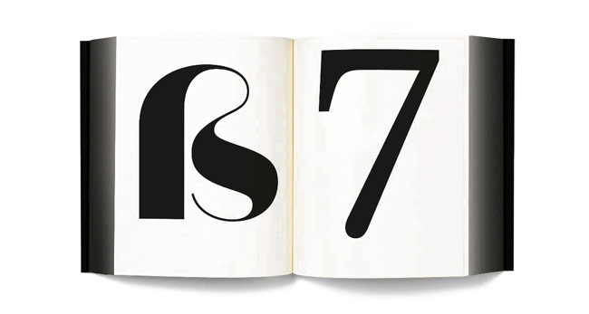
We are surrounded by letters. Yet how do we perceive them? Are we even conscious of it? For a type designer, letters are something they consider every day. Their relationship to letterforms is intimate and complex.
New Zealander Kris Sowersby of Klim Type Foundry lives such a life. He is one of the world’s most celebrated type designers.
Along with his popular library of commercial fonts, Sowersby has also designed custom typefaces for commissioners including The Financial Times, PayPal and National Geographic. In New Zealand, he has created custom type for The Bank of New Zealand, Trade Me and Tourism New Zealand.
Klim Type Foundry is based in Te Whanganui-a-Tara/Wellington. Sowersby has received numerous awards and accolades, including the John Britten Black Pin in 2015, the highest award given by the Designers Institute of NZ. In 2019, he was named an Art Laureate by the Arts Foundation for his continuing contribution to NZ art & design.
“It celebrates the absurd beauty involved in creating multiple expressions of predetermined alphabets through nuance and theory.”
Yet what about the letters themselves? The book examines Sowersby’s letter drawing practice while considering the characters as independent works of art, exploring their interconnections of function and style. It celebrates the absurd beauty involved in creating multiple expressions of predetermined alphabets through nuance and theory.
While a typeface is a well-considered set of many elements, if one removes the context of language systems and alphabets, each character may be viewed as a singular abstract drawing. A type designer spends their days drawing these characters, one at a time, as black form on white ground.
When looking at the output of Sowersby, different letterforms perfected day after day, the characters become art in their own right, allowing us to re-see, or to see for the first time, their individual form and beauty.
The book will be designed by Australian Mark Gowing and published by Formist Editions. It will feature an introduction by Gowing and a critical essay by Paul McNeil, respected UK graphic designer, writer and educator.
Sowersby and Gowing are collaborating on a custom typeface that will be used to typeset the book.
- Kickstarter page
- Enlightening interview with Kris Sowersby below
Share this Post